This is the front cover to the digipack for The Gaslight Anthem's 2008 album entitled 'The '59 Sound'. It features a large black and white image of the band. They are standing close together which shows their unity as a band and they are wearing clothing typical to rock bands (T-shirts and leather jacket) and this will help the taget audience relate to the band.
The style of the picture gives a vintage aesthetic which helps to show the band's influences and ties to the album's title - The '59 Sound.
The band name and title are in bold colours which make it stand out against the dark picture. The font also helps contribute to the vintage feel.
The back of the digi-pack is another black and white picture - this time of an amplifier and a pair of Converse shoes. These also help the target audience relate to the band as they are a common item of clothing amongst fans of alternative music.
The track titles are writen in the same font as the band name and album title of the front which gives a sense of conhesion to the digi-pack. They are in an alternating colour patter of grey and white except the title track, which is in blue (as the title is on the front) this helps it stand out and means there is no need for the title to be repeated on the back.
At the bottom of the back of the digi-pack is the address of the record label and and the website of the band. As the band are on an independent label they will havbe a greater bond withg their audience.
This is the back of the album booklet, on the left hand side of the interior of the digi-pack. It has the band name and album title at the top, in the same font as on the front which again helps to maintain cohesion throughout the digi-pack. It has the names of the band members and what they play on the album, which helps them connect with the audience as they can learn their names. It then has a comprehensive list of the various people assossiated with the production/marketing of the album. Then at the bottom their is a lits of 'thank -you' messages from the band. This pesents the band as more personal and 'real' to the audience. Tghe fonts are the same as the rest of the digi-pack and is once again white to contrast with the dark blue background.
.jpg)
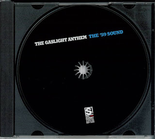
The CD tray is simple- it is plain balck behind (which ties in with the overall colour sceme of the digi-pack) with a plain black CD label. The band name and album title are once again written in the same font and colours as they appear on the rest of the digi-pack. The record label's logo appears at the bottom in a white font so it is quite visable to the consumer.


.jpg)
.jpg)