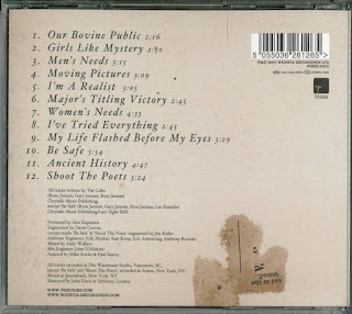
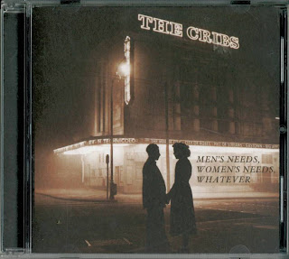
 The back cover of the digi-pack is lighter than the front, creating a good contrast; although it still keeps the same colour scheme as the front.The film imagery is still present as there is a ripped up ticket on the lower half , this being the only image on the back. On the right hand side of the top is the barcode and the record label's (Wichita Records) symbol. The song titles are laid out in a neat order in the same font as the album title on the front of the digi-pack. In smaller font beneath the track listing is the credits for the album listing the producers, mixers etc, as well as the recording locations. At the very bottom of the back is the website for the band and the label.
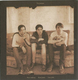
The inside cover features a picture of the band in the same style as the front of the digi-pack, making use of of sepia tone and a brown colour scheme. It is presented as an old family photograph, befitting the fact the band are all brothers, and so it has their family name at the top with their Christian names under the photograph corresponding with the position of the member. The band are wearing clothing that would easily identify them as an Alternative Rock band; skinny jeans, t-shirts and leather shoes. They are straight-faced, but not in the over-the-top style of ultra-earnest rock bands, but almost bored (which in itself is a recurring motif in alternative music, punk-rock especially).
.jpg) The CD tray is simple, fitting in with the subdued feel of the digi-pack. The insert is dark brown, like the front cover, which contrasts with the light brown CD label. The CD label features the band's name written in a retro font, while the album title and tracklisting remain in the same font as they are featured on the rest of the digi-pack.
The CD tray is simple, fitting in with the subdued feel of the digi-pack. The insert is dark brown, like the front cover, which contrasts with the light brown CD label. The CD label features the band's name written in a retro font, while the album title and tracklisting remain in the same font as they are featured on the rest of the digi-pack.