Popular Alternative Rock bands:
• Nirvana
• Pixies
• Muse
• Queens Of The Stone Age
• Weezer
• At The Drive In
• Foo Fighters
• Audioslave
• Manic Street Preachers
Alternative Rock is an umbrella term used to describe majority of the post-punk guitar bands since the 1980s. Although by definition it is fundamentally anti-mainstream, in the early 90s bands such as Nirvana topped the charts worldwide and since then alternative rock has been assimilated by the mainstream. Alternative rock can be vaguely categorised in two ways – either experimental acts with limited commercial appeal, or simply rock bands deemed to ‘edgy’ to be considered pop. Of course this is not an effective way of categorising as bands such as The Cure and fit have inhabited both categories over the course of their careers.
Although difficult to specify due to the breadth of the genre, general characteristics of alternative rock acts include:
• Dark colours; both clothing and album art etc.
• Lyrics more often covering social, political, or psychological topics.
An alternative rock music video might contain:
• Performance shots
• Heavy use of symbolism.
• Less reliance on special effects; due in part to lack of mainstream-level funding, and also to keep the audience’s attention on the song.
Alternative rock digipacks:
• Are less likely to make use of images of the band on the cover, instead often making use of artwork whether made by he band themselves (in the case of more DIY bands such as Los Campesinos! or Johnny Foreigner), or sometimes by famous designers (such as Storm Thorgeson who has made album art for bands such as Muse, Biffy Clyro, Audioslave, and Pink Floyd)
• Unlike pop artists, alternative rock bands will often be relying on a fanbase instead of attracting casual listeners and so will rely less on the attention grabbing tactics of a pop album cover.
Monday, 8 November 2010
Tuesday, 2 November 2010
Planning: Song Decision
After much thought I decided to use the track 'Machines' by Biffy Clyro for my music video. This song belongs to the genre of Alternative Rock. I decided to use it as the genre, and especially the band, makes use of rich imagery which would work really well in a music video, and bring up some interesting ideas for a digi-pack.
Monday, 4 October 2010
Planning: Email to Record Company (14th Floor Records)
Dear Sir or Madam
For our ‘A’ Level Media Studies coursework we have to make a music video to accompany a song. For our project we would like to use 'Machines' by Biffy Clyro and are seeking your permission.
The resulting music video will not be used for commercial gain, will be hosted on a private coursework blog and also rendered on to DVD for the attention of our teacher and the coursework moderator. Should we not hear from you to the contrary within 14 days of the date of this email we will assume that your are happy for us to use this music under a fair use arrangement.
Should you require any further information please contact our teacher, Mr Scargill on scargill@guilsborough.northants.sch.uk
Yours faithfully, Sonny Drake
Research: Digipack Deconstruction: The Gaslight Anthem - The '59 Sound
This is the front cover to the digipack for The Gaslight Anthem's 2008 album entitled 'The '59 Sound'. It features a large black and white image of the band. They are standing close together which shows their unity as a band and they are wearing clothing typical to rock bands (T-shirts and leather jacket) and this will help the taget audience relate to the band.
The style of the picture gives a vintage aesthetic which helps to show the band's influences and ties to the album's title - The '59 Sound.
The band name and title are in bold colours which make it stand out against the dark picture. The font also helps contribute to the vintage feel.
The back of the digi-pack is another black and white picture - this time of an amplifier and a pair of Converse shoes. These also help the target audience relate to the band as they are a common item of clothing amongst fans of alternative music.
The track titles are writen in the same font as the band name and album title of the front which gives a sense of conhesion to the digi-pack. They are in an alternating colour patter of grey and white except the title track, which is in blue (as the title is on the front) this helps it stand out and means there is no need for the title to be repeated on the back.
At the bottom of the back of the digi-pack is the address of the record label and and the website of the band. As the band are on an independent label they will havbe a greater bond withg their audience.
This is the back of the album booklet, on the left hand side of the interior of the digi-pack. It has the band name and album title at the top, in the same font as on the front which again helps to maintain cohesion throughout the digi-pack. It has the names of the band members and what they play on the album, which helps them connect with the audience as they can learn their names. It then has a comprehensive list of the various people assossiated with the production/marketing of the album. Then at the bottom their is a lits of 'thank -you' messages from the band. This pesents the band as more personal and 'real' to the audience. Tghe fonts are the same as the rest of the digi-pack and is once again white to contrast with the dark blue background.
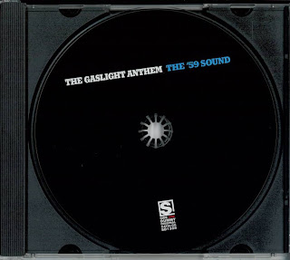
The CD tray is simple- it is plain balck behind (which ties in with the overall colour sceme of the digi-pack) with a plain black CD label. The band name and album title are once again written in the same font and colours as they appear on the rest of the digi-pack. The record label's logo appears at the bottom in a white font so it is quite visable to the consumer.
Monday, 27 September 2010
Research: Digipack Deconstruction: The Cribs - Men's Needs, Women's Needs, Whatever
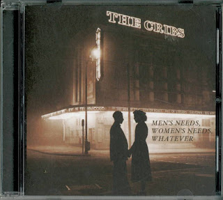
This is the front cover of digi-pack to The Cribs' 2007 album entitled 'Men's Needs, Women's Needs, Whatever'. It has a dark colour scheme - primarily using the colour brown due to the use of a sepia-coloured photograph as the cover image. In the foreground of the picture there are two silhouetted figures, a man and a woman, possibly representing the album title, with the album title next to them as a caption or dialogue. The cinematographic imagery of the sepia tone and the two lovers(?) is made more explicit by the cinema in the background. The bands name (The Cribs) is integrated into the picture in the form of a large sign (where the name of the cinema/theatre would usually be) this makes the picture look more natural and less like an album cover and more like a still frame from a film-noir. The album itself contains references to cinema, for example track four is entitled 'Moving Pictures' The band do not appear on the front (or back) of the digi-pack. This is most likely as the genre to which the band belong, Alternative-Rock, is less commercial and so the band would not trade on the image or looks of its members.
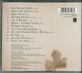 The back cover of the digi-pack is lighter than the front, creating a good contrast; although it still keeps the same colour scheme as the front.The film imagery is still present as there is a ripped up ticket on the lower half , this being the only image on the back. On the right hand side of the top is the barcode and the record label's (Wichita Records) symbol. The song titles are laid out in a neat order in the same font as the album title on the front of the digi-pack. In smaller font beneath the track listing is the credits for the album listing the producers, mixers etc, as well as the recording locations. At the very bottom of the back is the website for the band and the label.
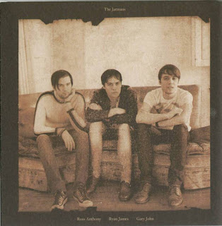
The inside cover features a picture of the band in the same style as the front of the digi-pack, making use of of sepia tone and a brown colour scheme. It is presented as an old family photograph, befitting the fact the band are all brothers, and so it has their family name at the top with their Christian names under the photograph corresponding with the position of the member. The band are wearing clothing that would easily identify them as an Alternative Rock band; skinny jeans, t-shirts and leather shoes. They are straight-faced, but not in the over-the-top style of ultra-earnest rock bands, but almost bored (which in itself is a recurring motif in alternative music, punk-rock especially).
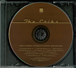.jpg) The CD tray is simple, fitting in with the subdued feel of the digi-pack. The insert is dark brown, like the front cover, which contrasts with the light brown CD label. The CD label features the band's name written in a retro font, while the album title and tracklisting remain in the same font as they are featured on the rest of the digi-pack.
The CD tray is simple, fitting in with the subdued feel of the digi-pack. The insert is dark brown, like the front cover, which contrasts with the light brown CD label. The CD label features the band's name written in a retro font, while the album title and tracklisting remain in the same font as they are featured on the rest of the digi-pack.
 The back cover of the digi-pack is lighter than the front, creating a good contrast; although it still keeps the same colour scheme as the front.The film imagery is still present as there is a ripped up ticket on the lower half , this being the only image on the back. On the right hand side of the top is the barcode and the record label's (Wichita Records) symbol. The song titles are laid out in a neat order in the same font as the album title on the front of the digi-pack. In smaller font beneath the track listing is the credits for the album listing the producers, mixers etc, as well as the recording locations. At the very bottom of the back is the website for the band and the label.
The inside cover features a picture of the band in the same style as the front of the digi-pack, making use of of sepia tone and a brown colour scheme. It is presented as an old family photograph, befitting the fact the band are all brothers, and so it has their family name at the top with their Christian names under the photograph corresponding with the position of the member. The band are wearing clothing that would easily identify them as an Alternative Rock band; skinny jeans, t-shirts and leather shoes. They are straight-faced, but not in the over-the-top style of ultra-earnest rock bands, but almost bored (which in itself is a recurring motif in alternative music, punk-rock especially).
.jpg) The CD tray is simple, fitting in with the subdued feel of the digi-pack. The insert is dark brown, like the front cover, which contrasts with the light brown CD label. The CD label features the band's name written in a retro font, while the album title and tracklisting remain in the same font as they are featured on the rest of the digi-pack.
The CD tray is simple, fitting in with the subdued feel of the digi-pack. The insert is dark brown, like the front cover, which contrasts with the light brown CD label. The CD label features the band's name written in a retro font, while the album title and tracklisting remain in the same font as they are featured on the rest of the digi-pack.Monday, 20 September 2010
Research: Group Decision
I decided that I would complete this project on my own. I believe that this is the best option as it gives me complete creative control and free to pursue my own ideas. Also it leaves me responsible for the work and so I'm neither slowed down by a partner, nor could I potentially slow down a partner. In short, the project is in my hands only and it's success or failure rests solely with me.
Tuesday, 6 July 2010
Music Video Deconstruction: Bright Eyes - 'Easy/Lucky/Free' Dir. Lauri Faggioni and Lily Thorne
This is a conceptual music video consisting of a single shot of a room. Conor Oberst (Bright Eyes' singer) walks in and writes the lyrics to the song on a transparent wall or board in front of the camera. Towards the end of the song (after the singing finishes) he walks out of the room. There is no apparent narrative or conventional performance of the song. There also no close-ups or star image motifs - as Bright Eyes is on an independent label, there would be less demand for 'selling' the artist as a brand.
The relationship between the music and the visuals is fairly contradictory as the light-coloured room contrasts with the darker music, and also at one point, while there is a pained cry in the background of the song, he draws a happy stick figure.
The video could be loosely compared to Radiohead's 'No Surprises' in which the singer is in a glass tank upon which the lyrics are projected.
Music Video Deconstruction: Muse - 'Sunburn' Dir. Nick Gordon
The music video for Muse's 'Sunburn' is a concept-based narrative music video which shows a girl attempting to steal from the family she is babysitting for. The band then appear in the mirror, performing the song, as a manifestation of her 'guilty conscience'. There is a clear relationship between the music and the visuals as the video starts off subdued (as does the music) but as it progresses , there are more close-ups, jerky-camera angles, and quicker transitions - mirroring the music of the song becoming more frantic.
There is less relation between the lyrics and the video, but the concept of the video's narrative is based upon 'guilty conscience' which is mentioned in the song.
There is clear reference to the notion of looking - the girl and the young boy she is supposed to be looking after appear to be watching television at the beginning. Much of the video also features a mirror, which is used to symbolise secrets.
This music video is from the band's early days, so they have not yet developed any clear image-motifs. However there are some genre characteristics, such as the dark clothing and hair of the band which helps represent their alternative/rock image.
It could be argued that the video includes some hegemonic values as the girl appears to suffer as a result of stealing.
[Embedding is disabled, but video can be found here: http://www.youtube.com/watch?v=N9SZaOJEWXU]
Tuesday, 29 June 2010
The Key Features Of A Music Video
Andrew Goodwin, in Dancing In The Distraction Factory (1992, Routledge), has identified the following features of music videos:
1. Music videos demonstrate genre characteristics (eg stage performance in a rock video, dance routines in a boy/girlband video).
2. There is a relationship between the lyrics and the visuals (either illustrative, amplifying, or contradicting)
3. There is a relatiomship between the music and the visuals (either illustrative, amplifying, or contradicting)
4. The demands of the record label will include the need for lots of close-ups of the artist and the artist may develop motifs which recur across their work (a visual style)
5. There is frequent reference o the notion of looking (screens within screens, telescopes etc) and particularly voyeristic treatment of the female body
6. There is often intertextual references (to films, TV programmes, other music videos)
It is also worth considering
Whether the music video is primarily performance-based, narrative-based, concept-based, or a hybrid, and how elements of each are used in it.
You can also use Goodwin's categories to analyse music videos for yourself.
Subscribe to:
Comments (Atom)


.jpg)
.jpg)
